Brand Identity That Feels Premium: A Practical Guide for Modern Businesses
in How To, Inspiration, Knowledgebase on January 10, 2026A premium brand identity is not just a logo—it’s the complete visual language that people recognize, trust, and remember. In a digital-first world, where customers scroll fast and compare instantly, strong branding becomes one of the most valuable assets a business can build. At MU Creative, we treat brand identity as a strategic system: crafted to communicate clearly, look consistent everywhere, and elevate how people perceive your business.
What makes a brand feel premium?
Premium branding is built on clarity and consistency. It feels intentional. Colors are chosen with purpose, typography is balanced, spacing is clean, and every visual decision aligns with the brand’s personality. Premium does not mean “complex.” Often, it means the opposite: fewer elements, better decisions, stronger execution.
1) Start with positioning before design
Before choosing fonts or colors, you must define the foundation:
- Who is your audience?
- What problem do you solve?
- What makes you different?
- How do you want people to feel about you?
A clear positioning statement becomes a design compass. Without it, branding becomes decoration—and decoration rarely builds trust.
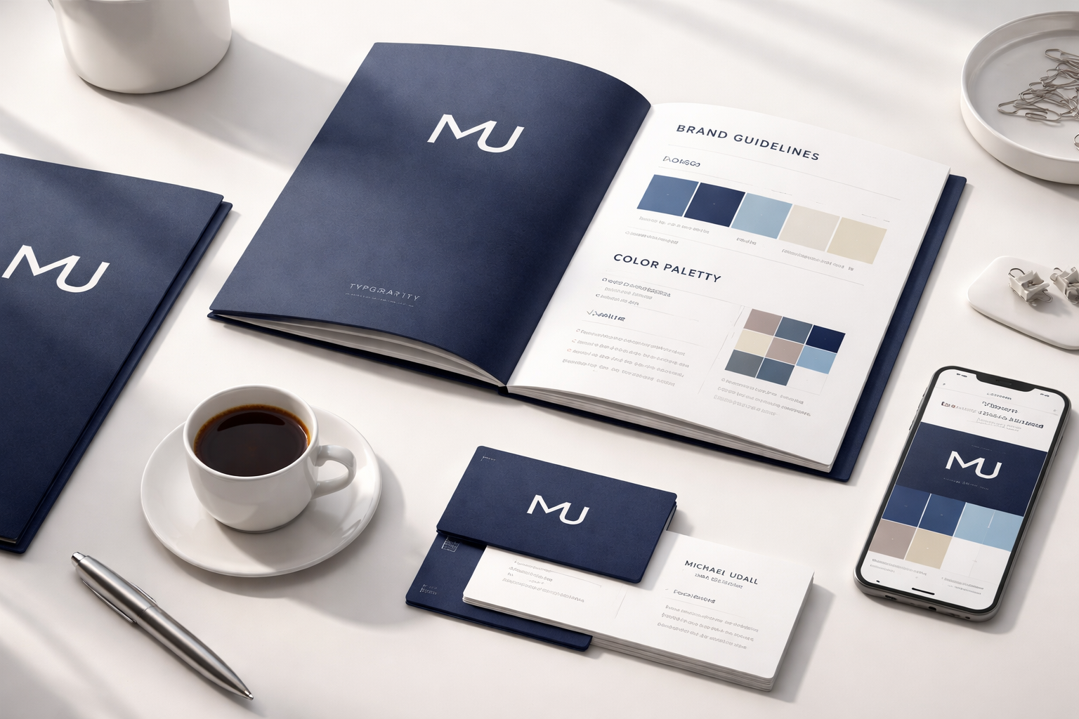
2) Build a brand system, not a single logo
A professional identity includes:
- Logo suite (main logo, simplified logo, icon/monogram)
- Color palette (primary + secondary + neutrals)
- Typography (headline font + body font, with clear hierarchy)
- Layout rules (spacing, grid, alignment)
- Brand elements (patterns, shapes, icon style, imagery direction)
This system ensures your brand looks consistent on Instagram, on your website, in presentations, and on marketing materials.
3) Typography is a luxury signal
Typography is one of the strongest indicators of quality. Premium brands use type with control: thoughtful pairing, strong spacing, and clear hierarchy. If your brand uses inconsistent font sizes, too many weights, or weak contrast, it can instantly feel amateur—even if the logo is decent.
4) Color should support emotion and meaning
Colors trigger perception. Navy can signal trust and stability. White space signals confidence and simplicity. A bright accent can signal innovation. The goal is not to “choose a nice color.” The goal is to create a palette that supports your brand values and works in real use: backgrounds, text, buttons, print, and mobile screens.
5) Consistency builds trust faster than creativity
Creativity is important, but consistency is what builds recognition. If your social posts, website, and brochures look like three different brands, customers will hesitate—because inconsistency feels risky. The best branding allows freedom inside a framework: flexible content, consistent structure.
6) Premium design also means premium execution
Your identity should include real-life deliverables:
- Social media templates
- Website-ready logo files
- Brand guidelines PDF
- Print-ready files for business cards and documents
When these assets are well-prepared, your brand feels professional everywhere, instantly.
Final thought
Premium branding is not about “looking expensive.” It’s about looking credible, intentional, and consistent. If you’re ready to build an identity that stands out and scales with your business, MU Creative can help you craft a complete brand system designed for modern growth.
CTA: Want a premium identity? Contact MU Creative to start your branding project.